I built a live, self-updating dashboard for work health and safety data
A free, live dashboard of work health and safety data from eight countries: 146,700 serious Australian claims, fatalities and illness, every figure source-checked.
- WHS
- OHS
- Open Data
- Workplace Safety
- Data Visualisation
- AI
I build tools that turn safety data into decisions. So I built one for myself, then put it online for anyone to use. It's called the Open Data Dashboard, it lives at neetsingh.com/dashboards/whs, and it pulls work health and safety data from eight countries into a single live view: work-related deaths, serious injury claims, the mechanisms behind them, and work-related illness, all from official statistics, all refreshed on their own.
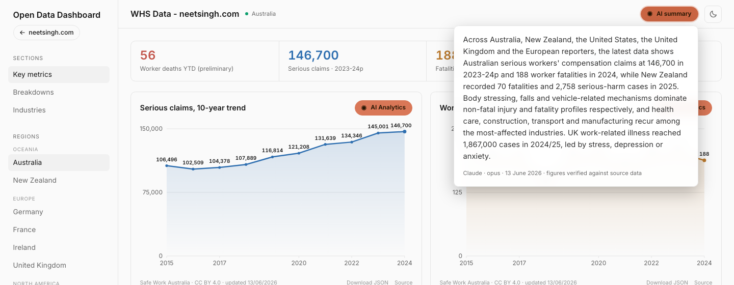
The figure it opens on says plenty. In 2023-24, Australian workers lodged 146,700 serious workers' compensation claims, up from 106,496 a decade earlier (Safe Work Australia, 2024). That number, and the decade of rise underneath it, used to mean downloading a spreadsheet. Now it's the first thing you see. This post is a tour of what the dashboard does, what it already shows about the state of work safety, and how I keep its AI commentary honest.
What does the Open Data Dashboard show?
It shows the work health and safety numbers safety people actually use, for eight countries, in one place. Australia, New Zealand, Germany, France, Ireland, the United Kingdom, the United States and Japan, drawn from twenty official datasets. Pick a country in the sidebar and the whole page redraws around that country's sources, definitions and caveats.
The Australian view opens on four headline figures: preliminary worker deaths this year, serious claims, traumatic fatalities, and the leading claim mechanism. Below them sit the ten-year trends, then breakdowns of how people are getting hurt and killed, then an industry league table and a "this fortnight" panel. It reads top to bottom like a briefing.
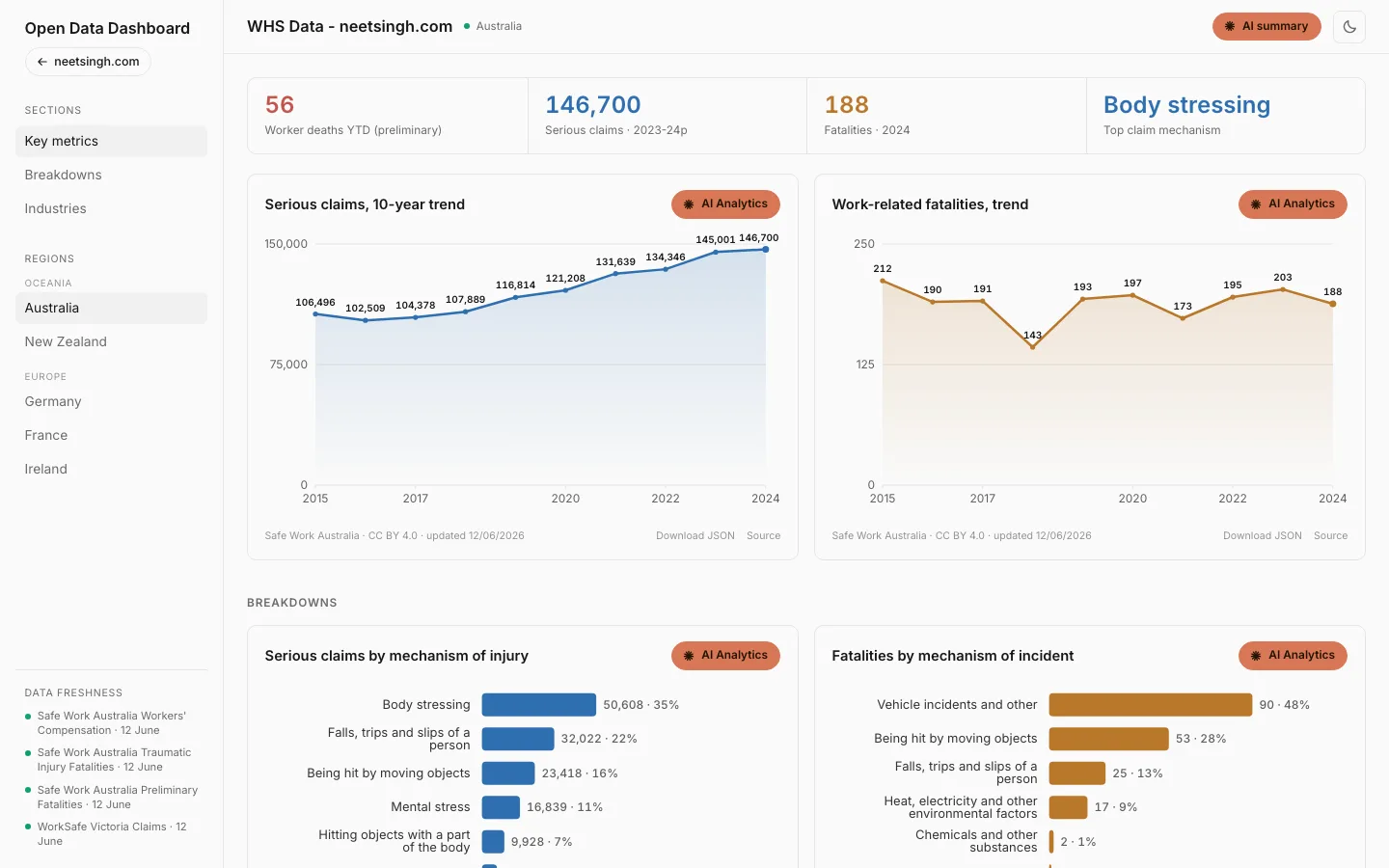
 The Australia view. Serious claims have climbed to 146,700, traumatic fatalities sit at 188, and body stressing leads the claim mechanisms.
Every chart carries its own provenance. Under each one you'll find the agency, the licence, the date it was last refreshed, a link back to the source dataset, and a Download JSON link so you can take the raw numbers. Nothing on the page asks you to take it on faith.
Why does workplace safety data need a home like this?
Because the data exists, but it's scattered, slow and hard to compare. Safe Work Australia, the HSE, the US Bureau of Labor Statistics and the rest all publish good numbers. They just publish them in different formats, on different calendars, often as PDFs or deep spreadsheet tables that take real effort to read.
Think about the last time you needed a current, defensible figure. A board paper, a toolbox talk, a business case for more resourcing. You wanted one number you could stand behind, with a citation, from this year and not 2019. So you went hunting through a regulator's site, found three versions of the figure, and weren't sure which was the latest. That hunt is the problem.
The dashboard answers a narrower question on purpose: what is the latest figure, and can I trust it? One click, with the source and the date attached. It's the same instinct behind the rest of my safety work, from encoding the WHS Act into an AI skill to a broader field guide on AI in workplace safety. Get the inputs right, make them legible, then decide.
What does the data actually say right now?
Quite a lot, and not all of it comfortable. In Australia, serious claims have risen for most of the decade while fatalities have stayed stubbornly flat. There were 188 traumatic work-related deaths in 2024, which sits inside the 143 to 212 band the country has held since 2015 (Safe Work Australia, 2024). Body stressing leads the claims; vehicle incidents lead the deaths.
Switch to the United Kingdom and the story changes shape entirely. The dominant problem there isn't injury, it's illness. An estimated 1.9 million people reported work-related ill health in 2024/25, and more than half of that is stress, depression or anxiety (UK Health and Safety Executive, 2025).
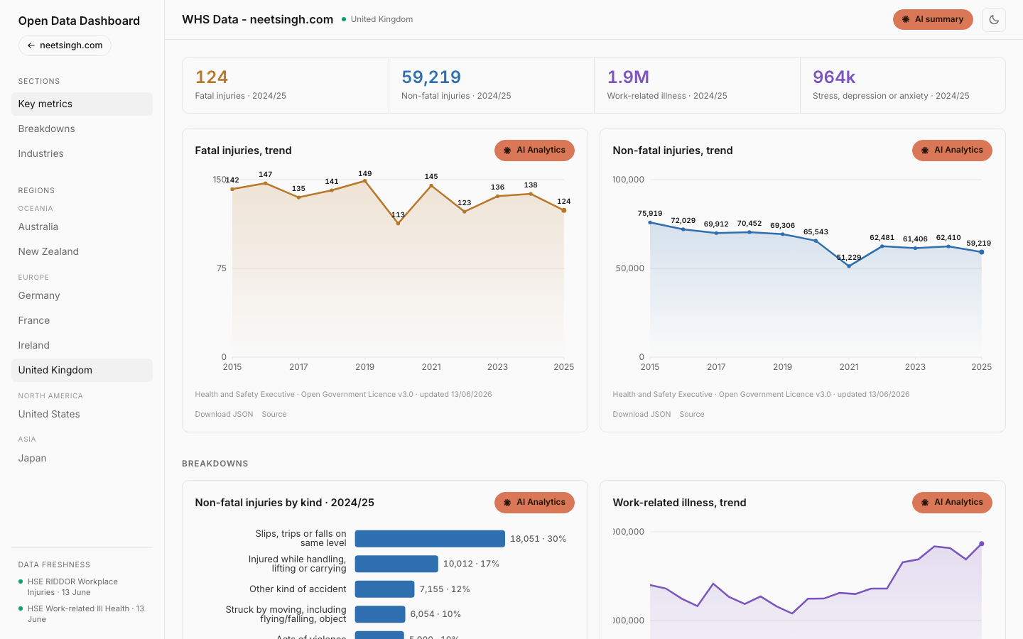 The UK view. Reported work-related illness keeps climbing, led by stress, depression and anxiety, even as physical injuries trend down.
That single chart is the data behind the psychosocial shift the whole profession is wrestling with. It's one thing to assert that mental health is now the front line of work safety. It's another to show it, with a number you can cite.
| Category | Value (k) |
|---|---|
| Stress, depression or anxiety | 964k |
| Musculoskeletal disorders | 511k |
| Other illness | 175k |
| Breathing or lung problems | 53k |
| Headache or eyestrain | 50k |
| Infectious disease | 47k |
The other countries each tell their own version. The United States recorded 5,486 fatal work injuries in 2022 (US Bureau of Labor Statistics, 2022). Japan recorded 700 work-related deaths in 2025, the largest share of them in construction (Japan MHLW, 2025). Germany, France and Ireland reported 403, 811 and 39 fatal accidents respectively for 2023 (Eurostat, 2023).
Can you trust an AI dashboard with safety data?
Only if the AI cannot make a number up. That's the line I drew, and it's the part I'm most careful about. Every chart has an "AI Analytics" button, and a plain-language summary sits at the top of the page. Both are written by Claude. Both are checked, figure by figure, against the source data before they ever publish.
Here's the mechanism. The model writes a short, descriptive line about a chart. Before that line goes live, every number in it is matched against the actual dataset behind the chart. If even one figure isn't found in the data, the whole sentence is discarded and replaced with a neutral template. So the published commentary can describe the data, but it can never quietly invent a statistic.
 The page summary, written by Claude and then checked against the numbers. The footer reads "figures verified against source data" only when every figure in it matched.
The commentary is also boxed in on what it's allowed to say. It describes what the data shows and nothing more. No causes, no "because", no recommendations, no safety advice. A dashboard should tell you the falls are up, not tell you why or what to do about it. That judgement is yours.
This is the same position I keep coming back to: AI belongs around the safety decision, not on it. It's brilliant at making a pile of official statistics readable in a sentence. It has no business deciding what the numbers mean for your workers. The grounding check is just that principle, written into code.
What does the "this fortnight" panel add?
Currency. Most of the data refreshes once a year, because that's how often regulators publish it. Australia's preliminary work-related fatalities are different. They're media-sourced, published far more often, and the dashboard refreshes them every fortnight so the year-to-date count stays live.
As of mid-June, 56 Australians had died at work so far in 2026, and 34 of those deaths were vehicle incidents (Safe Work Australia, 2026). The panel breaks that down by industry and by mechanism, and it watches for categories running ahead of their usual pace, flagging anything that's drifted well above the prior year's average at the same point.
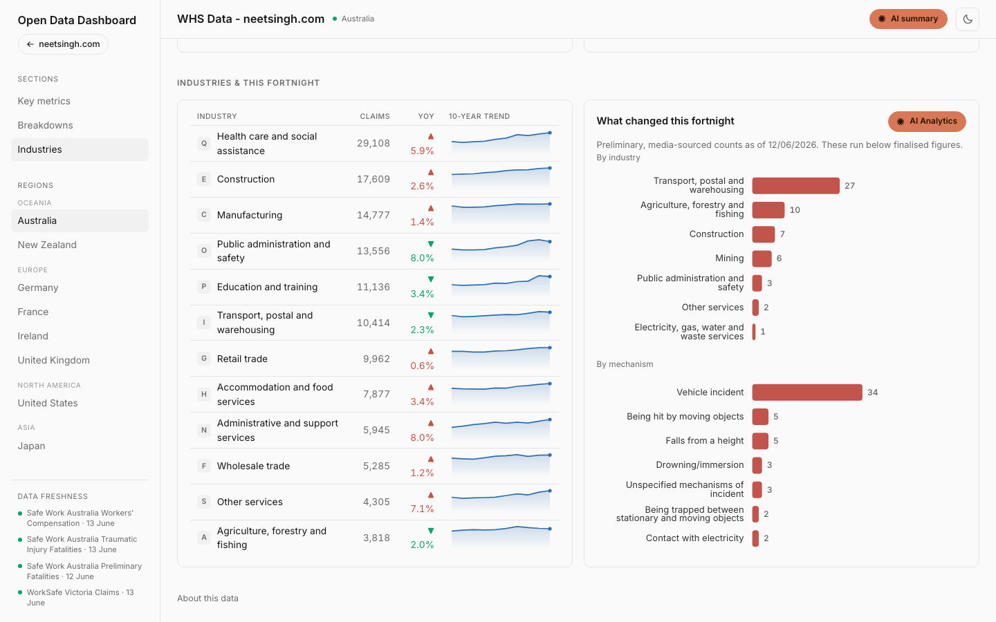 The industries league table and the fortnightly preliminary-fatalities panel, which flags any mechanism or sector running ahead of its prior-year pace.
| Category | Value |
|---|---|
| Vehicle incident | 34 |
| Being hit by moving objects | 5 |
| Falls from a height | 5 |
| Drowning or immersion | 3 |
| Unspecified | 3 |
| Contact with electricity | 2 |
| Trapped between objects | 2 |
| Hit by falling objects | 1 |
These counts are preliminary and run below the finalised figures, which is exactly why the dashboard labels them that way. The value isn't precision, it's the early signal. A sector creeping up its own ranking is worth a second look long before the official numbers confirm it a year later.
How does it work, for the curious?
The plumbing is simpler than it looks. A scheduled job fetches each official dataset, parses it, runs sanity checks on the shape of the numbers, then publishes clean views to a fast edge store that the page reads from. The charts are hand-built, so the whole thing stays quick and light. New countries slot in through a single registry file rather than new code, which is how it went from Australia to eight countries.
Two schedules keep it current. A monthly run on the third of each month refreshes most sources, and a fortnightly run on the 1st and 15th handles Australia's preliminary fatalities. The AI commentary runs on my own Claude subscription as part of that job, not on every page load, so the page itself stays fast and the analysis is already waiting when you arrive.
If the build-it-yourself angle is what interests you, I wrote a more personal version of this when I turned my LinkedIn export into a dashboard with Claude Code. Same move, pointed at public safety data instead of my own.
How should you use it?
Treat it as a fast, citeable starting point. It's free, there's no login, and it's built to give you a current figure with its source attached in seconds. Grab the number for your board paper, follow the Source link to the original release, and pull the raw data with Download JSON if you want to go deeper. Read each country on its own terms, and lean on the caveats under every chart, because they're there for a reason.
What I keep coming back to is the gap this closes. Good safety decisions need current, trustworthy data, and for too long that's meant a research project every time. The Open Data Dashboard is my attempt to make it the default instead. If you work in safety and you build the business case, run the toolbox talk, or write the board paper, go and use it. And if there's a country or a dataset you wish it covered, tell me. I'm adding them one at a time.
Frequently asked questions
- Where does the dashboard's data come from?
- Only official open-data sources: Safe Work Australia, WorkSafe Victoria, WorkSafe NZ and ACC, Eurostat, the US Bureau of Labor Statistics, the UK Health and Safety Executive, and Japan's Ministry of Health, Labour and Welfare. Every chart links to its source and licence.
- How often is it updated?
- Automatically. A scheduled job refreshes most countries monthly, on the third of each month. Australia's preliminary work-related fatalities refresh every fortnight, on the 1st and 15th, so the year-to-date count stays current without me touching it.
- Can I compare one country directly against another?
- Carefully. Each country counts and defines injuries differently, so raw rates are not comparable across borders. The dashboard flags this on every region, and it's best read as eight separate pictures rather than one league table.
- Is the AI commentary trustworthy?
- It's deliberately constrained. The commentary only describes what the data shows, never gives advice or guesses at causes, and every figure is verified against the source numbers before it publishes. If a number can't be matched, the sentence is swapped for a plain template.
- Is it free, and can I take the data?
- Yes. The dashboard is free and needs no login. Every chart has a Download JSON link so you can pull the underlying numbers for your own analysis, next to a link to the original source dataset.